
Perfect colour combinations for your presentation
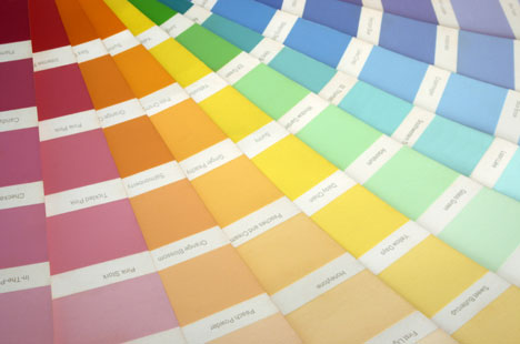
Why choose a colour scheme?
Choosing the right colours for your PowerPoint presentation can be a fundamental factor in its success.
Often you may have put a rough version of your design together and can see that something is not quite right, a little time spent researching and trying out various combinations of colours may be what brings the whole thing together.
Be consistent
It’s important that the chosen colours for graphs and tables, fonts and headings, logos and pictures do not clash with each other and are consistent throughout. This will give a professional edge to your slides. If your colour scheme changes from slide to slide this will take away from the unity of your message and will make your presentation look amateurish.
Another factor to remember is that text needs to be legible, so should contrast with any background picture or colour. Also the audience to which you are presenting should influence your choice of colour scheme. A young audience may respond more readily to a bright highly contrasting colour scheme while an older and more conservative audience may prefer more muted earthy colours, though there are no absolute rules in this.
Top web sites for colour scheme inspiration and tools
So where can you find inspiration?
Well here is a list of great web sites and resources that we have found useful in choosing great colour schemes.
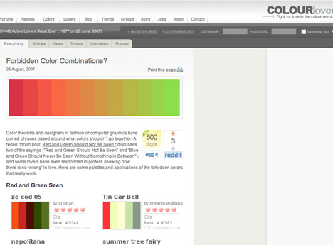
colourlovers
Colourlovers is a great site for lovers of colour everywhere with some great articles and thought provoking insight into colour and its usage.
They also have a great blog at colourlovers blog.
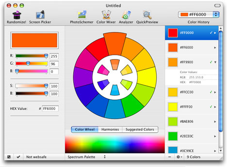
colourschemer
This site has some great tools for both PCs and Macs for creating colour schemes. They are all free to download.
Also check out their blog colourschemer blog for extra resources.
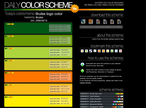
dailycolourscheme
The daily colour scheme does what it says and offers daily colour schemes that you can import into design programs such as Adobe’s Photoshop and Illustrator.
DeGraeve
This great little site offers you the ability to upload a photo from your collection, and it then generates a colour scheme to match.

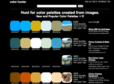
colourhunter
Colour hunter is similar to the above in that you can enter the URL of an image and it will generate a colour coordinated scheme to match.
snook
This offers a solution to the problems of colour contrast, when you really need the text to stand out and be legible then colour contrast is important.
Here you can check your colour combination and see whether it offers enough contrast.

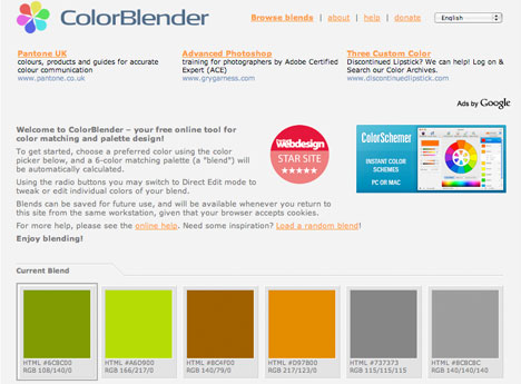
ColorBlender
ColorBlender is another online colour mixing tool that is simple to use and offers great results.
worqx
This is a great reference web site for all things about colour.With some great articles about colour theory and combination, it explains the difference between CMYK and RGB colour, amongst many other things.

logoorange
Logoorange offers a colour code matching chart, so if you come across a colour code in CMYK you can find out what it is in RGB.

colr
Another chance to play with your images, but this time you can load pictures from Flickr and view schemes made by other people, great for inspiration.

We hope these resources will be of good use to you in creating good-looking presentations.
You can also have a look at some of the colour schemes used within our free templates and borrow some ideas from them.
If you have any comments or suggestions or if there are any good colour-related resources you know of, then please let us know below.
do not spam!
Suspicious comments will be deleted.
 Add to